


Maps
A variety of maps and charts focused on Africa’s Internet exist and new infographics are appearing at a steady clip. Over 80 of our favorite visuals from around the world are featured below. Explore color-coded connectivity maps from 1993 or view the info-state of Africa circa 2009. Or, perhaps you are more interested in the renowned Africa Undersea Cables map maintained by Steve Song. Either way, these maps from 1993-present are sure to enlightening, encourage, and entertain:
Updated Regularly
- Intra-Africa Optical Fibre Network. {Ubuntunet} A map not only showing undersea cables but also trans-continental lines.
- Internet Users (through 2013) This interactive map from Google labs utilizes data from the World Bank. {Google Public Data}
- Greg’s Cable Map. {cablemap.info} A geocoded/interactive map of global undersea cables. Landing points and bandwidth are given if you click on a cable.
- Facebook Statistics by Country. {SocialBakers} Facebook users, growth, and penetration rate by country. Updated monthly.
- Afrografique (tumblr). {afrographique.tumblr.com} Created in late-March 2011, this site already contains a handful of colorful visuals depicting social media stats in Africa, with a concentration on South Africa. Very accessible.
- OpenNet Initiative Maps. {ONI} Interactive maps depicting the state of filtering within each country. Also includes social media filtering maps.
- World Map of Social Networks. {Vincos.it} An attempt to map the most popular social networks by country. Many African countries lack data (from Alexa and Google Trends). August 2015.
- Updated list of African IXPs. {oAfrica} A list of African Internet Exchange Points, with map and recent additions.
- State of the Internet Report. {Akamai} Data gathered across Akamai’s global server network about attack traffic, average & maximum connection speeds, Internet penetration and broadband adoption, and mobile usage, as well as trends seen in this data over time.
- Sensorly Coverage Maps. {Sensorly} User-generated coverage maps for mobile and WiFi networks in dozens of countries.
- Geographic Representation of Internet Society Locations. {ISOC} All local chapters of the organization are mapped out by city.
- How Neutral is the Net? {Net Neutrality Map} A map of the percentage of measurement lab tests where violations of net neutrality was discovered worldwide. There is limited African data.
- Colocation Data Centers. {Data Center Map} Eight African nations (of 95 globally) have a colocation data center.
- Mobile for Development Intelligence Network Coverage. {Mobile for Development Impact} A great map for checking 2G geographic coverage by operator for most African countries.
- 4G LTE World Coverage Map. {WorldTimeZone} LTE, WiMAX, HSPA+, 3G, GSM information by country.
2016
- The State of LTE February 2016. Great map at the bottom of the page showing countries with LTE (148) and where LTE deployments are scheduled. {OpenSignal}
2015
- Mapping the world’s 4.3 billion Internet addresses. {Washington Post} Much of Africa has one IP address per 50-1000 people.
- Where is Mozilla? {Mozilla Foundation} There are Mozilla communities in 11 African nations.
- The World Online. {Geonet} Total number of Internet users in a country along with the percentage of the population that has Internet access. An update of a 2011 version.
- Innovation Spaces of the World. {Mapbox} Includes dozens of African tech hubs.
- Women’s Tech Organisations in Africa. {Crowdmap} Digital mapping of women’s technology organizations in Africa.
- Africa’s Terrestrial Transmission Network Reaches 1 Million Kilometres During 2015. {ABM} Seventh annual edition of the Africa Telecom Transmission Map published by Hamilton Research.
- Tech Hubs Across Africa (as of September 2015). {World Bank} A thorough PDF capturing nearly every African tech hub. Discussion too.
2014
- Visualization of Twitter Data from Nairobi. {idiap.ch} Geolocated tweets from Nairobi over a 3-month period near the end of 2013, with a total of 200,000 tweets in the data set.
- National Internet Diversity at the International Frontier – February 2014. {Renesys}
- Most popular mobile phone brand. {StatCounter}
- Most popular web browsers, 2009-2014. {StatCounter}
- Global Internet penetration, affordability, download speed, limits on content. {Internet Society}
- The world without the Internet. {Washington Post}
- Hubs in Africa. {Crowdmap} Digital mapping of African tech hubs, innovation hubs, and hackerspaces by BongoHive. Updated 2014.
- How Africa Tweets. {Portland Communications} Analysis of nearly 12 million geo-located Tweets originating on the continent during the last three months of 2013.
2013
- Global Internet Map. {TeleGeography} TeleGeography currently provides multiple versions of an interactive global broadband map available for free.
- Géographie Facebook de Dakar. {Mesodev} A simple attempt to estimate Facebook usage by neighborhood in Dakar, Senegal.
- Growth in Active Connected Devices. {Flurry} According to app data, CAR, and Niger experienced a negative growth rate of smartphones in 2012. Chad and Guinea saw 300+% growth.
- Map of MENA Cyber Laws. {Batchgeo} A user-generated map that reflects the poor legislation related to cyber security in North Africa.
- OpenSignal. {OpenSignal} A general sense of mobile network coverage by country, by city, and by provider. Roughly accurate to a city level, but not street level.
- Connected by Country. {NYT} A visualization of the percentage of people who use the Internet, using ITU data from 2012.
- African Undersea Cables. {manypossibilities.net} Information regarding planned connections from the rest of the world to the African mainland. Updated monthly.
- Africa Bandwidth Maps 2013/4. {ABM} These detailed maps show international cables, terrestrial links, and bandwidth amounts for nearly every network in Africa.
- Broadband Affordability. {Information Geographies} The relationship between average yearly income per capita and the cost of a broadband subscription using 2011 data.
2012
- Internet Exchange Map. {TeleGeography} A free interactive map plotting all global IXPs, including 20 in Africa.
- Geographies of the World’s Knowledge. {Zero Geography} Maps of Wikipedia, Google, and Flickr content generated by every nation.
- Interactive: Mapping the World’s Friendships. {Facebook Stories} Ranks the depth of Facebook social ties between all countries.
- AfTerFibre. {Flickr: ssong} Mapping African Terrestrial Fibre Optic Infrastructure. 26 photos of terrestrial networks in Angola, Namibia, Kenya, Uganda, Mali, Ethiopia, Benin, Nigeria, Cameroon, Zimbabwe, Sudan, and more.
- Mapping Twitter in African cities. {FloatingSheep.org} Maps of all geocoded tweets published in November 2012 in Accra, Cairo, Dar es Salaam, Cape Town, Johannesburg, Lagos, Tunis, Nairobi, Kigali, Mogadishu, and Addis Ababa.
- Allo Africa? Mobile phone market in Africa. Infographic depicting mobile providers, penetration rates, and largest African mobile markets. {mHealth Africa}
- IPv6 prefixes per country. The number of IPv6 prefixes (networks) by country. {MyBroadband}
- Fibre in SA: An eye-opener. {MyBroadband} Three South African fibre networks are depicted (Neotel, Infraco, Telkom)
- Africa Mobile Factbook 2012. {Africa & Middle East Telecom Week} Page 48 shows a map of mobile penetration as of 2Q 2011. Page 49 shows 2Q 2010.
2011
- Countries that offer 2G/3G services commercially, mid-2011. {ITU} A global map from the ITU showing whether a nation offers 3G service.
- World map of Facebook users. Color-coded ranges based on data from Internet World Stats. {Targetmap}
- Télécoms : coup d’accélérateur sur la 3G. {Jeune Afrique} Includes a map showing which countries offer 3G service as of 2011 and if 3G is planned for 2012.
- State of Fiber Infrastructure in Africa. {EuroAfrica-ICT} Dozens of slides showing submarine, terrestrial, backbone, and regional cables across Africa (along with capacity and other statistics).
- Global Internet Traffic is Expected to Double by 2015. {The Atlantic} An infographic with Internet traffic projections broken down by continent. Africa shows the greatest growth rate.
- Middle East Protests: An animated map. {Slate} By Elizabeth Weingarten and Chris Wilson from Slate Magazine. This map depicts the tides of protests and government retaliations day by day, with info boxes and color coding. Updated through at least 3/21/11.
- ACE (Africa Coast to Europe). {ACE} Information on the undersea cable that will connect 23 nations. Includes a nice animation.
- How wired are the Middle East and North Africa? {CNN} This interactive map isn’t necessarily up-to-date, but nonetheless provides a reference for those interested in North African social revolutions. Facebook data from the Arab Social Media Report. Internet and mobile stats from 2009 ITU report. February 2011.
- ccTLDs of Africa. {Appfrica} In this image, the country code top level domains of Africa are organized by geoposition. The top countries are scaled to reflect the number of Internet users. February 2011.
- Best Practices for Liberia’s Internet Eco-System. {Google} Google has created a short whitepaper with interesting charts of African Internet usage per capita, estimated Internet usage in Liberia (2007-2010), and Internet-related demographics of select African countries. Published February 2011.
2010
- Facebook-NASA Mashup. {Tulane ICT4D} An overlay of Facebook connections on top of a photo of the Earth at night showing electricity/urban areas.
- Kenya’s national fiber optic Internet backbone. {Flickr: inveneo} Image of the 22,000km network from inveno’s Flickr account. December 2010.
- Mobile OS usage splits the world (chart). {Pingdom} Mobile OS share based on web usage. Africa sees a huge share of Symbian OS. Data from October 2010.
- SAIX International Topology. Map showing the precise routes involved in the South African Internet Exchange. {SAIX}
2009
- What countries are riskiest to visit on the Internet? {CNET} McAfee compiled a report in late 2009 on the riskiest top-level domains based on how many malicious websites were found during a test period. Cameroon’s .cm ranks as the most dangerous TLD.
- Infostate of Africa. {Appfrica} A robust visualization of African growth. November 2009.
- Color-coded Internet Penetration Map. {oAfrica} Created from IWS. 2009.
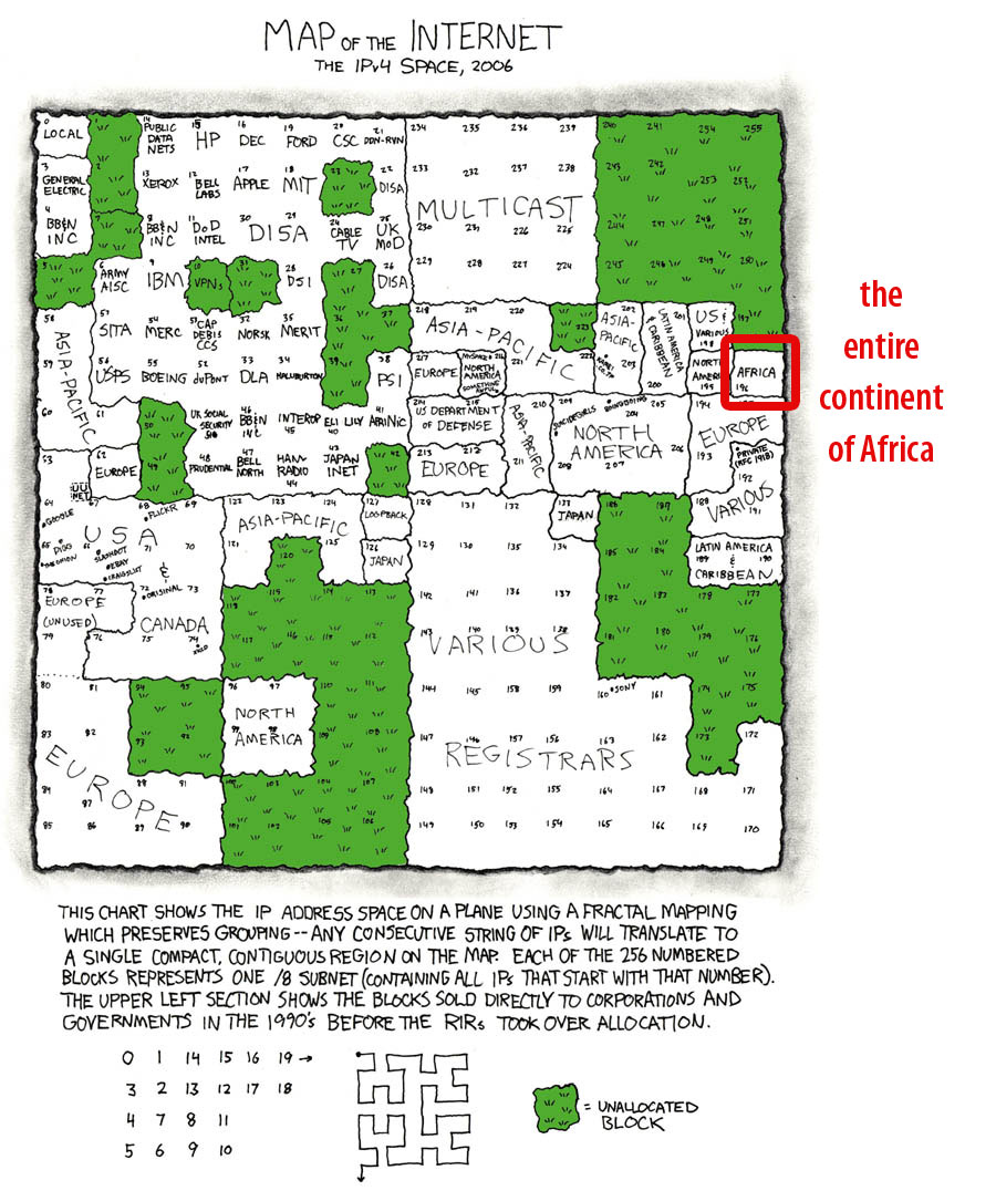
- Map of the Internet, IPv4. {White African} Apple Computer has the same size block as all of Africa. July 2009.
- Internet Development in Africa. {sanog.org} A PDF document with multiple maps and charts showing current and planned connections, in addition to African bandwidth trends and predictions. January 2009.
2008
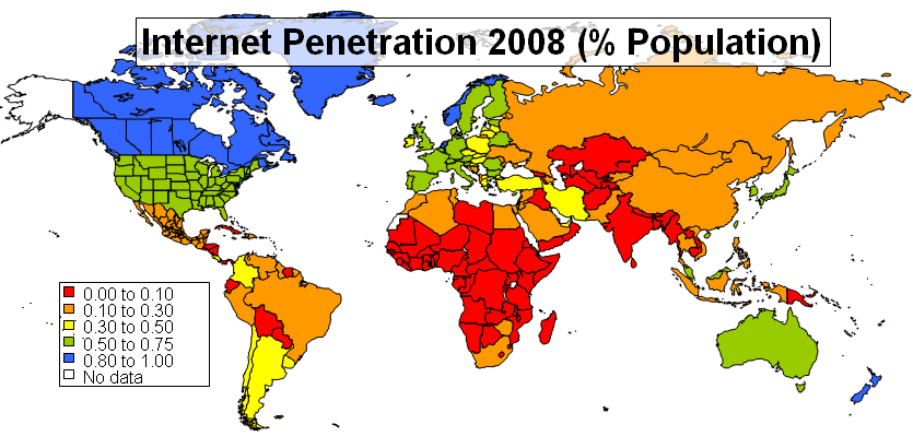
- Internet Penetration, 2008. {slac.stanford.edu} A worldwide map showing percentages of the population connected to the Internet, by nation.
- Africa’s Internet Exchange Points. {White African} A visual of the 18 IXPs across 15 countries, as of July 2008.
- Visualize African Connectivity. {Youtube: sciencedissemination} A YouTube video showing network performance measured from Italy to African universities, from April 2007 to March 2008.
- Mobile Broadband Internet in Africa. {White African} Mobile phone density and top ten African countries in terms of Internet use. Mid-2008.
- The World of Internet, June 2008. {researchreinvented.blogspot.com} A colorful and detailed map.
2007
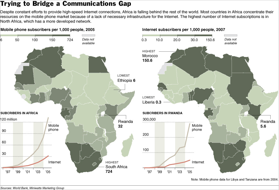
- Trying to Bridge a Communications Gap. {Flickr} New York Times graphic showing mobile phone subscribers from 2005 and Internet subscribers using 2007 World Bank data. Also shows trends from 1997-2005.
- An Atlas of Cyberspaces. {Atlas of Cyberspaces} Dozens of visualizations (geographic, cables, traceroutes, census) of Internet traffic over the years. A solid dozen include Africa.
- World map of social networking preferences, 2007. {lemonde.fr} Africa preferred Facebook, followed by Hi5.
2006
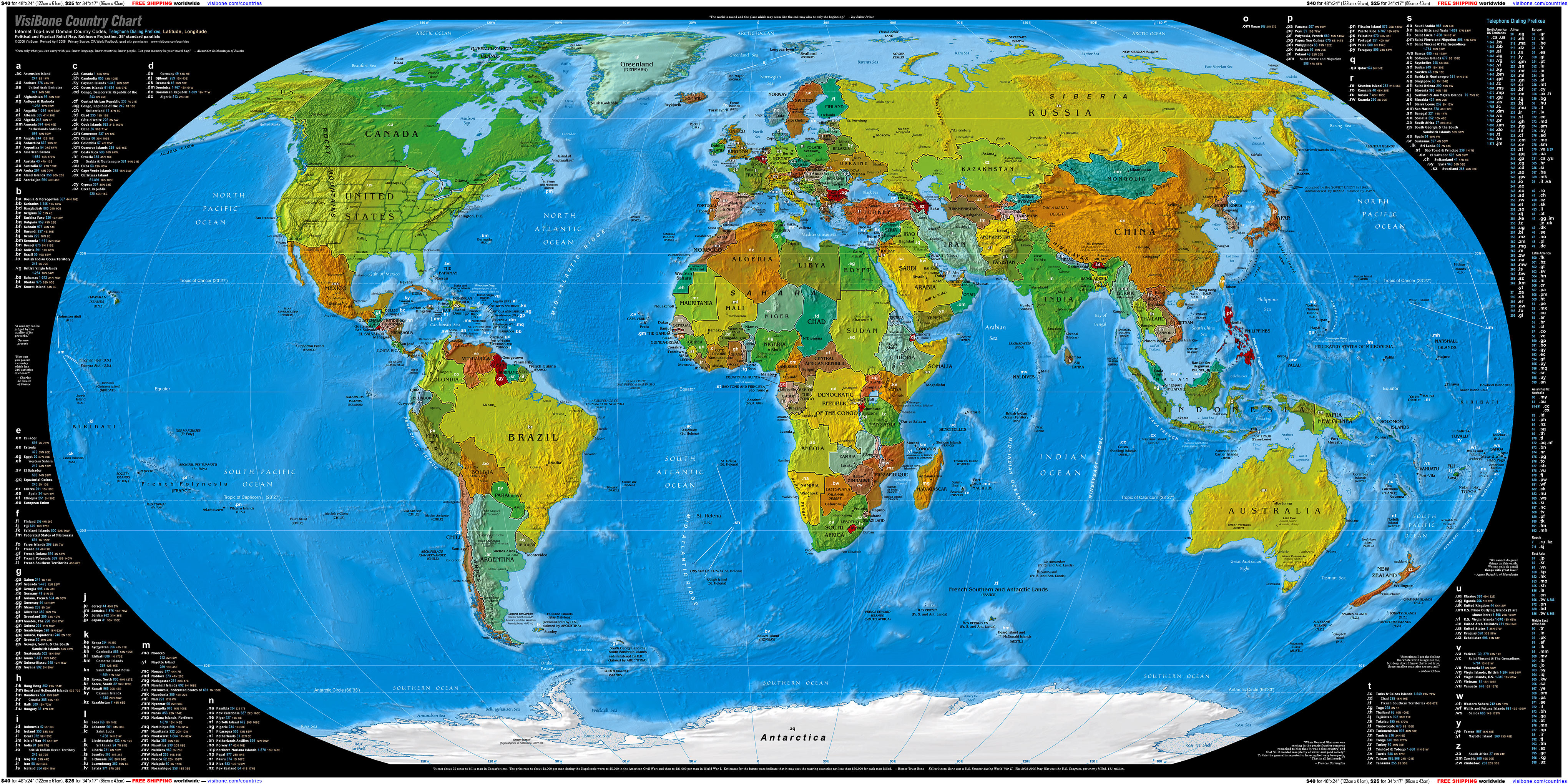
- Country Chart. {visibone.com} Shows top-level domain country codes for every nation. 2006.
2005
- The Acacia Atlas 2005. {IDRC} Elaborate report from the IDRC. The best source for past African Internet maps.
2003
- Vintage Internet maps, 1991-2003. {oAfrica} 14 maps depicting African connectivity are reviewed.
- Internet Users in World Countries. {Conceptual Devices} An animated map that uses national flags to represent the number of Internet users. Projection is from 1993-2015.
2002
- The Internet: Out of Africa. {IDRC} The colored circle in each country on the map shows, to exact scale, the international bandwidth in bits per capita available from publicly accessible IP networks. Also shows VSAT presence, GDP, and submarine cables.
- Teleaccess Inside Africa. {IDRC} GSM coverage, Internet POPs, and fixed lines by nation.
2000
- AfricaONE. {Atlas of Cyberspaces} Map of cables and landing points of the failed undersea fibre-optic ring for Africa.
- Mappa.Mundi Maps of the Month. {Mappa.Mundi} From June 1999 until October 2001, this magazine featured a different map chronicling global Internet traffic flow. Many include Africa, although data was certainly limited.
1995
- International Connectivity Map, 1995. {oAfrica} Scanned from an Internet directory from 1995. Approximately one-quarter of African nations still had no Internet connection, mostly due to war or geographic location. Most of these nations still lag the rest of Africa in terms of connectivity.
1993
- Internetology (NSRC). {NSRC} A color-coded map showing which African nations had full Internet, e-mail access, or no connectivity as of November 1993. At this point, most nations at least had e-mail access. Also has maps from 1994-1997.
The preceding list is updated on a monthly basis from posts and links that have circulated the Internet. If you have additional maps to provide, please contact oAfrica.


 Twitter
 Facebook
 Pinterest